MYZIMA
Client work
2025-now
Visual identity
Typography
Motion design
Swiss ceramic artist Mylène needed a visual identity for Myzima, her artist brand, and ``Atelier Myzima``, where she runs workshops. Inspired by Japan, her world is clean and elegant: she wanted something playful, yet sober and refined.
CLASSY BUT
PLAYFUL
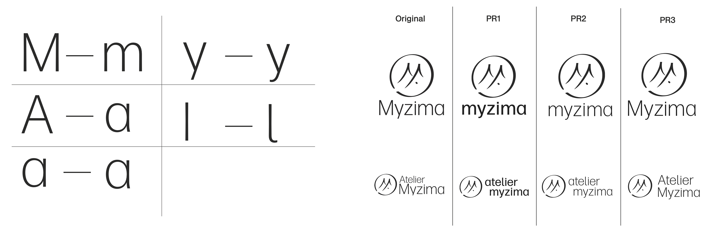
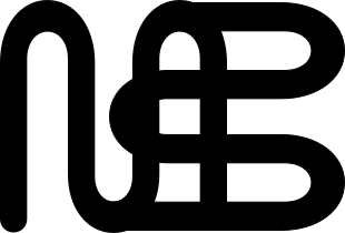
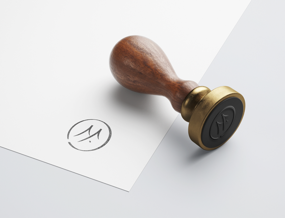
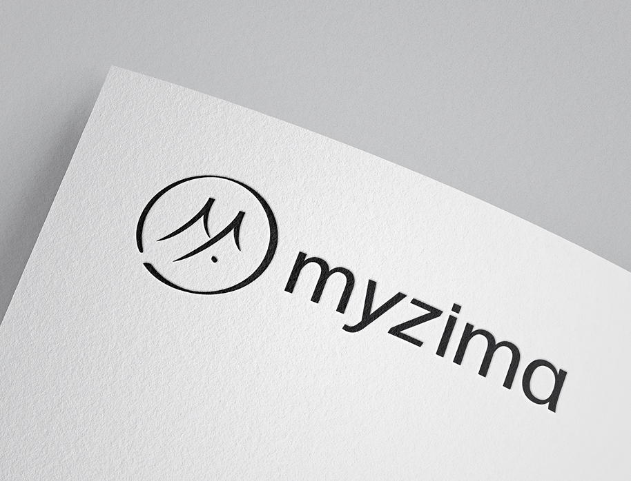
Myzima’s seal draws on Japanese prints: an M and a Y woven together, with an outline that recalls the Jura mountains Mylène comes from.
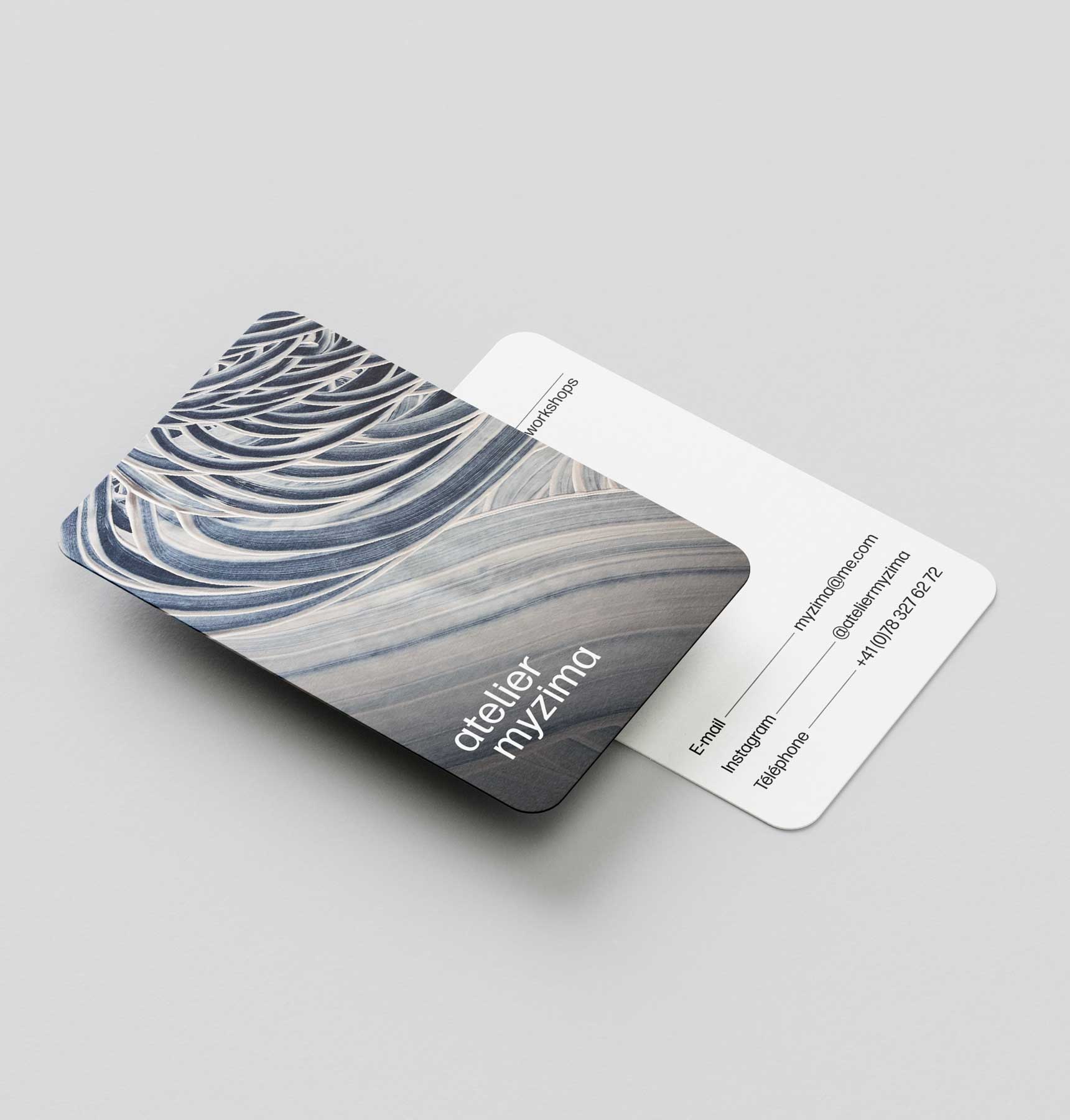
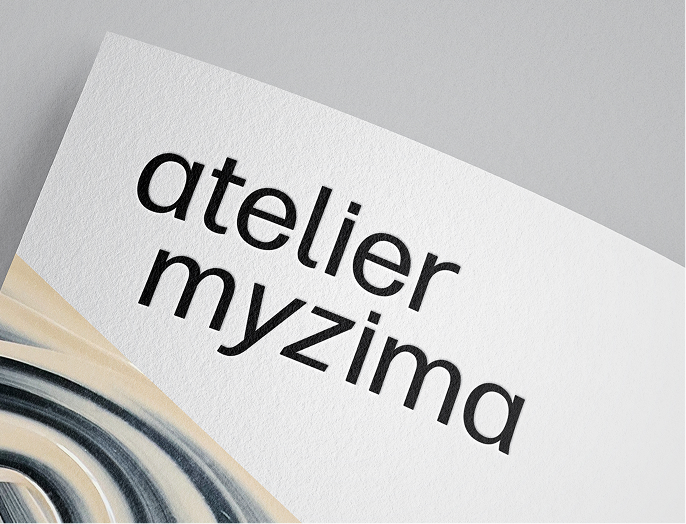
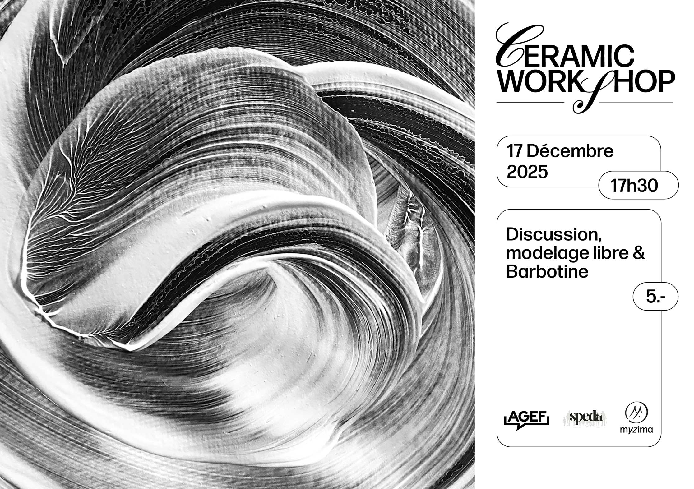
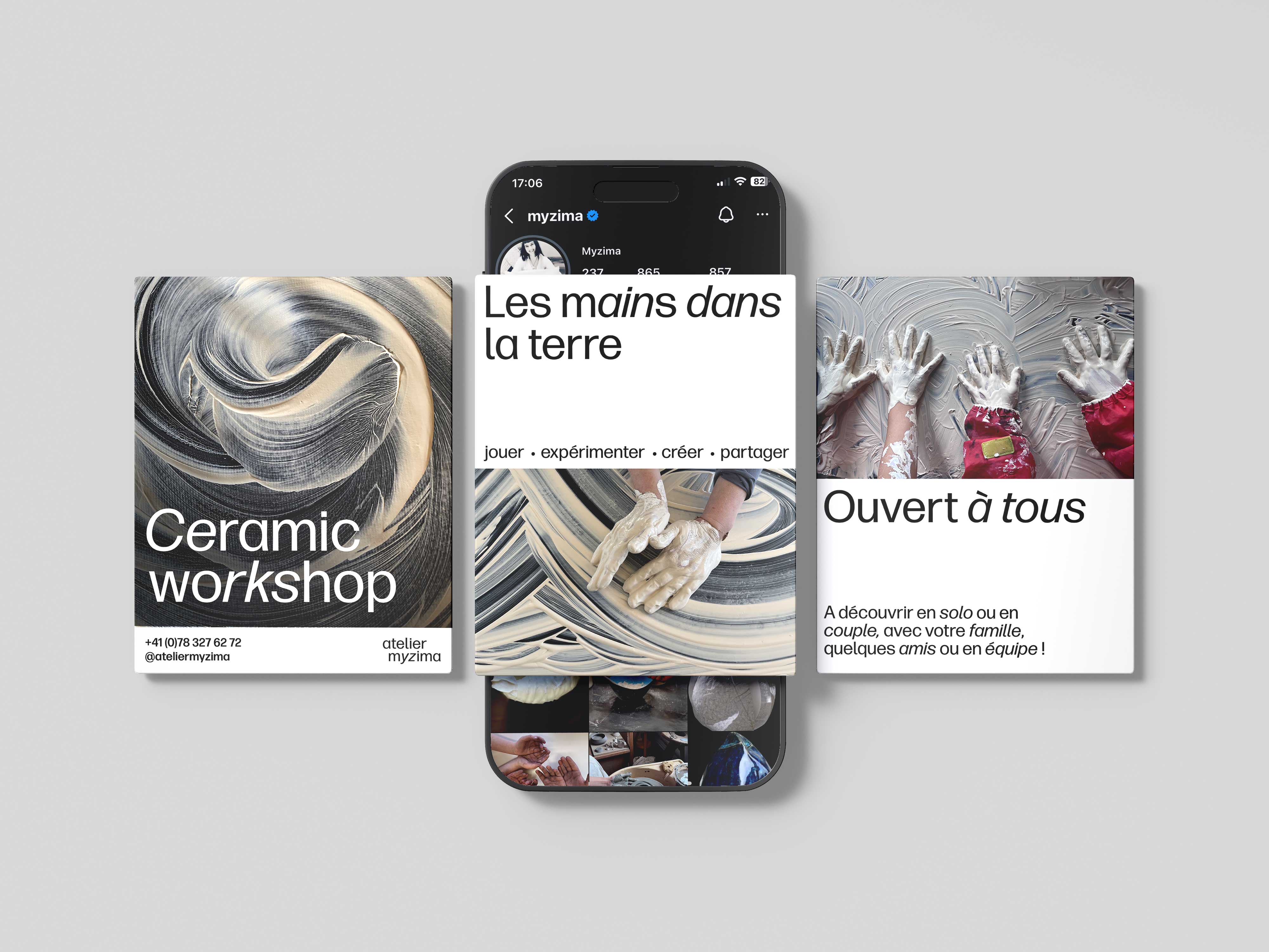
The rest of the identity lives mostly in the type. Some letters stand firmly anchored, others lean and slip into italics, as if they couldn’t keep still. Mixed together, they give the words a playful rhythm, while the layouts stay calm and minimal.
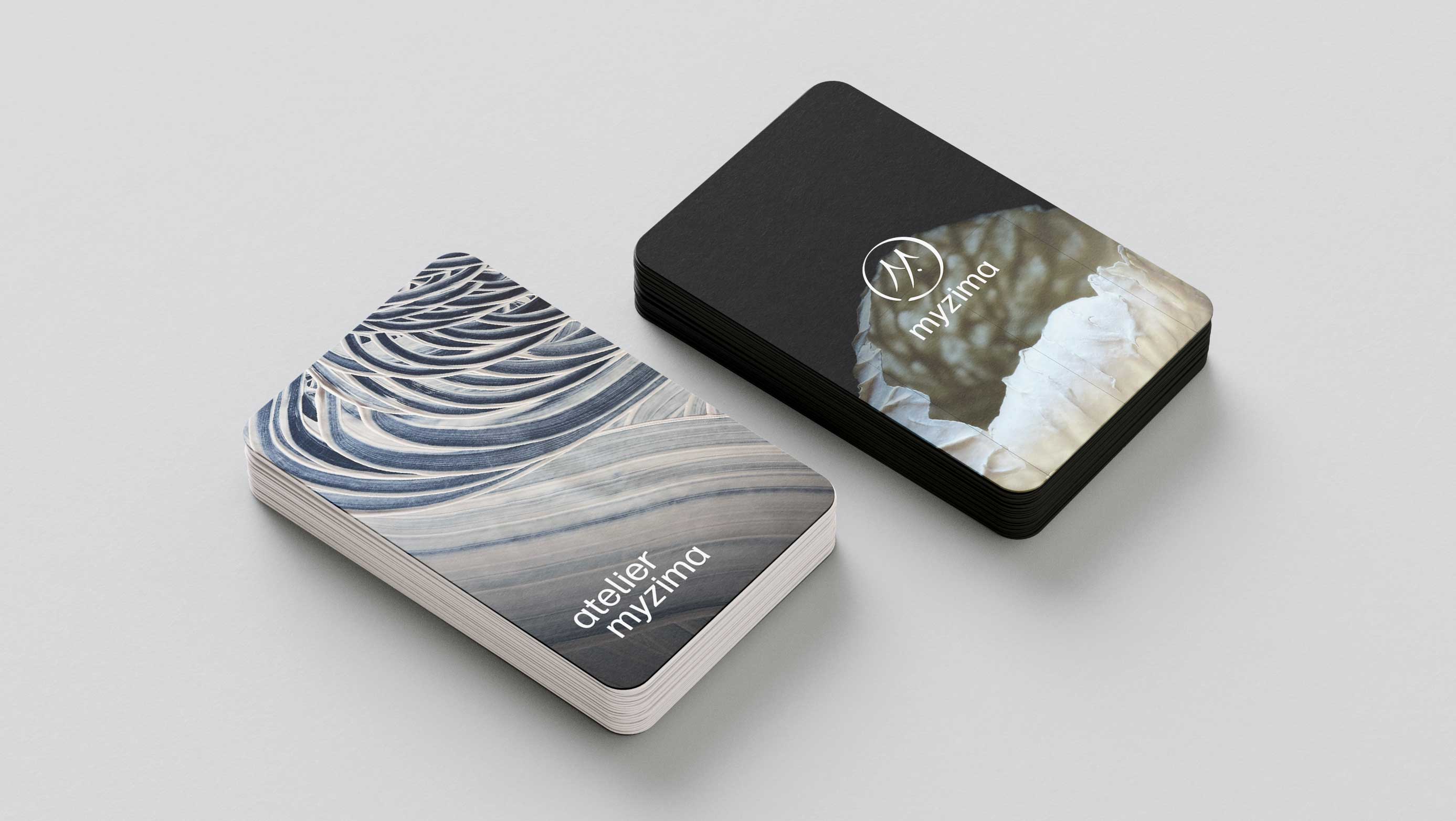
At Atelier Myzima, Mylène invites people to get their hands dirty and play with clay. So the photos show just that: hands and earth, caught in motion.
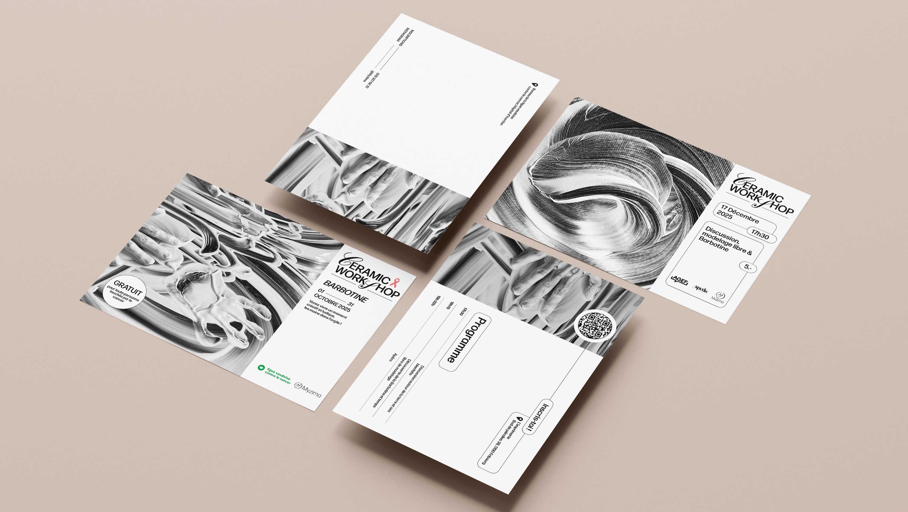
HANDS IN THE CLAY, LETTERS IN MOTION
RESEARCH
I had already designed a first logo for Myzima, and with the rebranding I wanted to take it further. I softened the lettering with tailed alternate glyphs to make it more fluid. Atelier Myzima became purely typographic, while Myzima kept its seal, now set in lowercase and medium weight for better legibility.
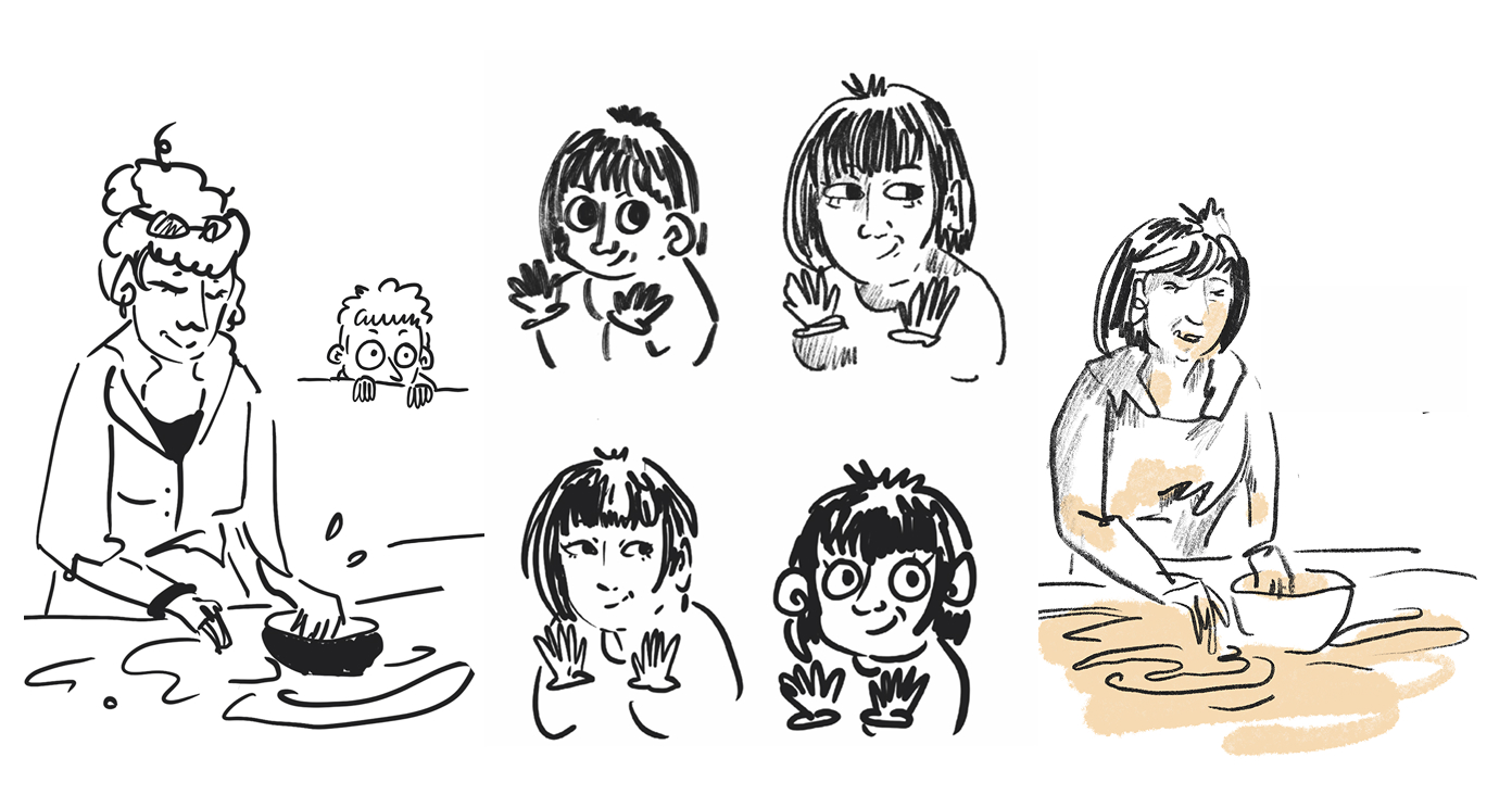
I also explored a naive, illustrative direction, but dropped it: it didn’t fit the project.