CASE A CHOCS
School project
2025
Visual identity
UX design
Case à Chocs is a music venue in Neuchâtel, dedicated to contemporary and alternative music. It supports the local scene and stands for inclusivity and diversity. The brief was to create a young, dynamic visual identity.
BREAKING THE FRAME
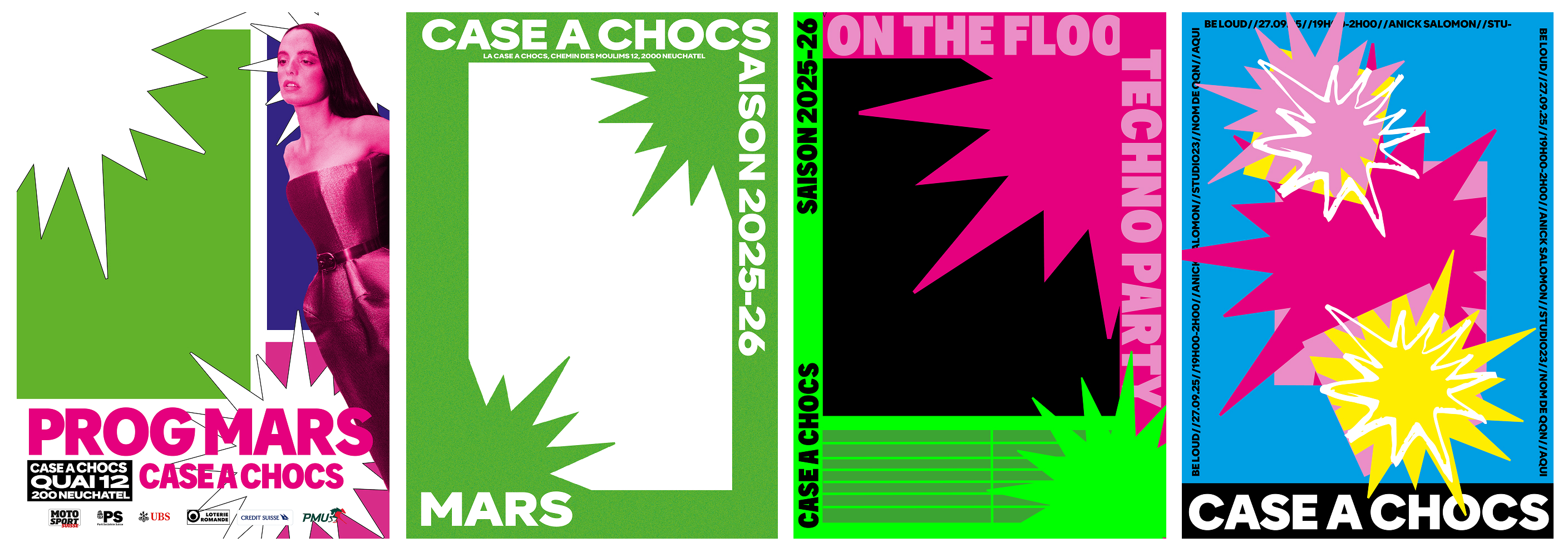
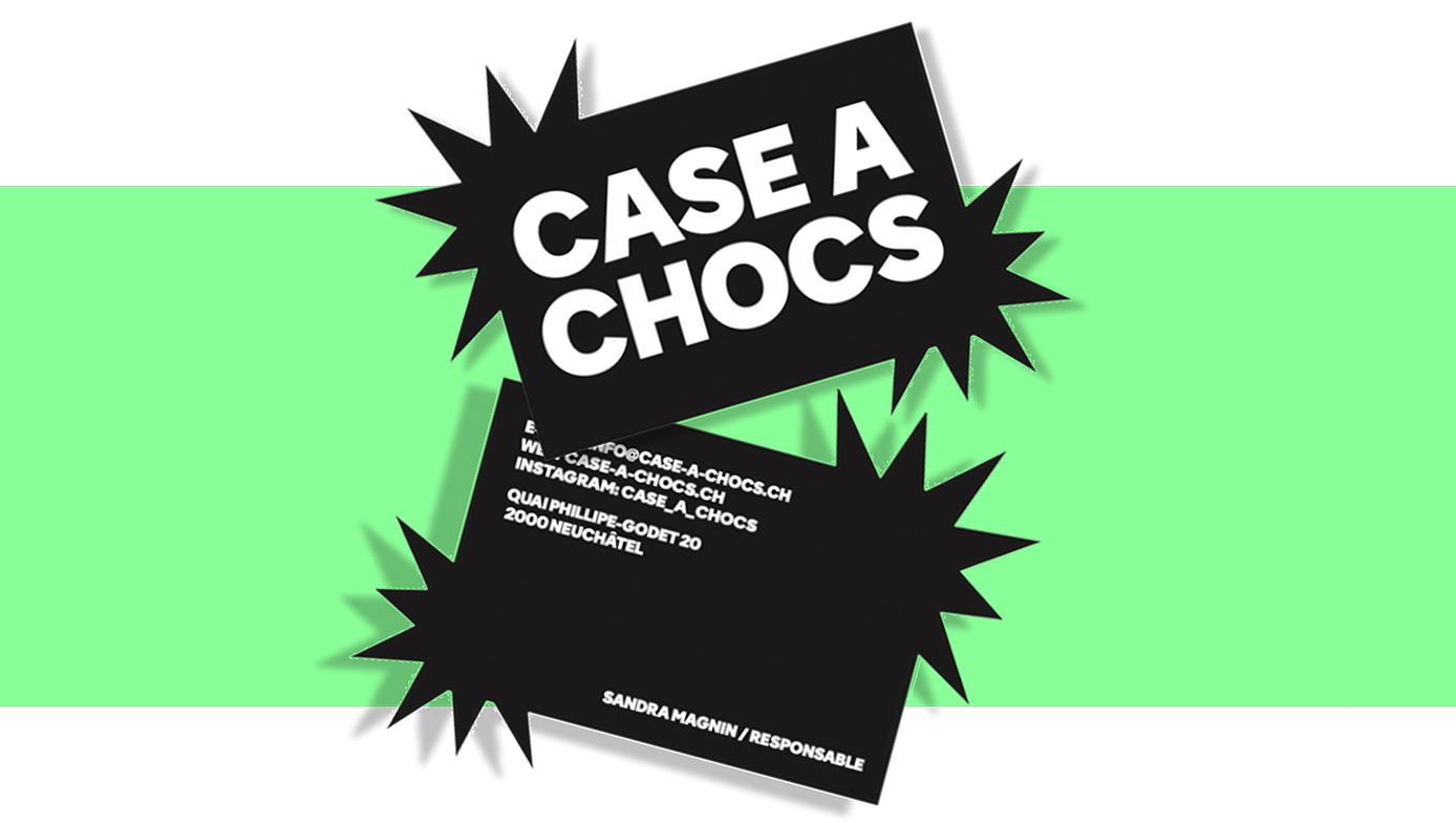
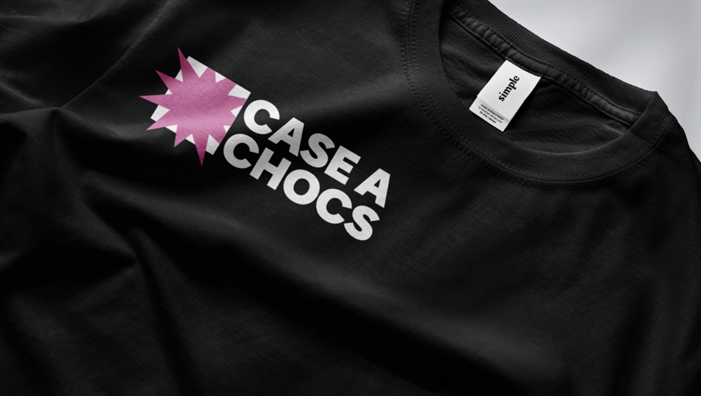
The concept starts from the name, but not only. In French, « case » means a box and « chocs » means shocks. The venue gives space to new artists who step outside the ordinary, in a place full of energy. From there came the idea of a star-shaped burst breaking out of a frame.
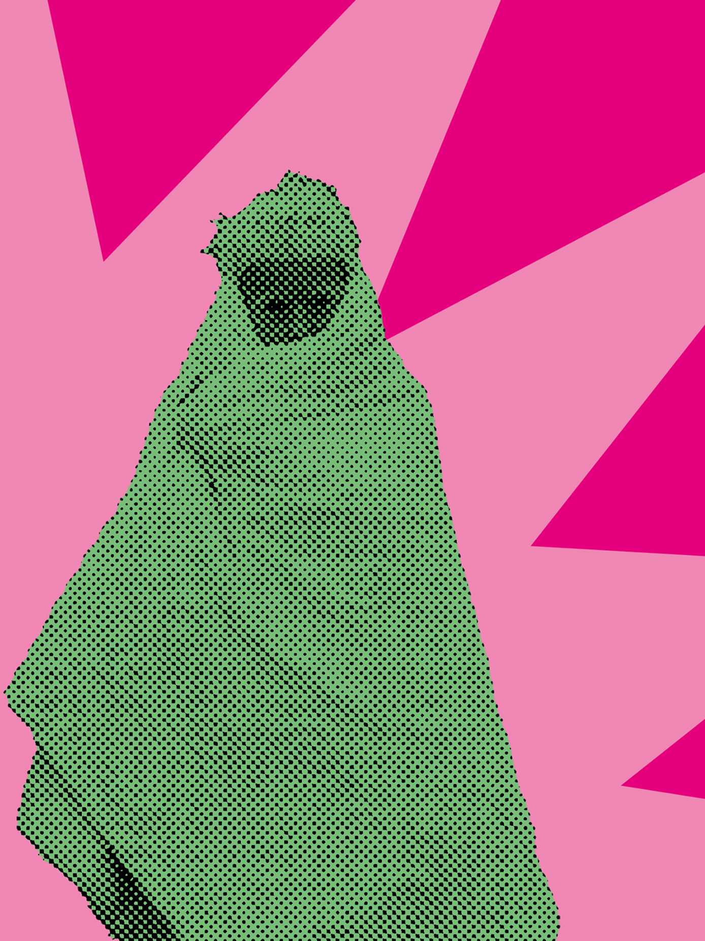
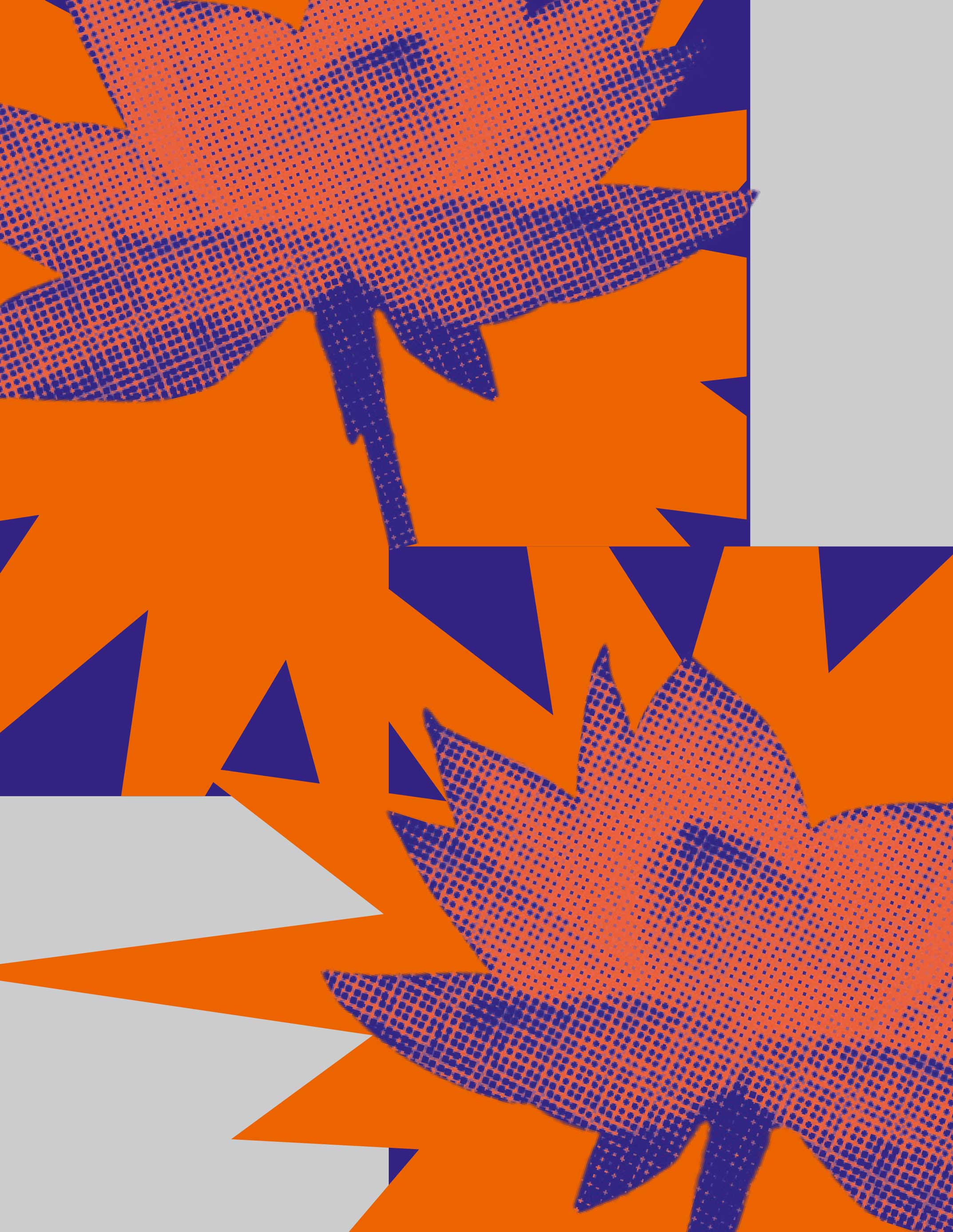
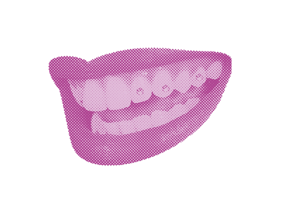
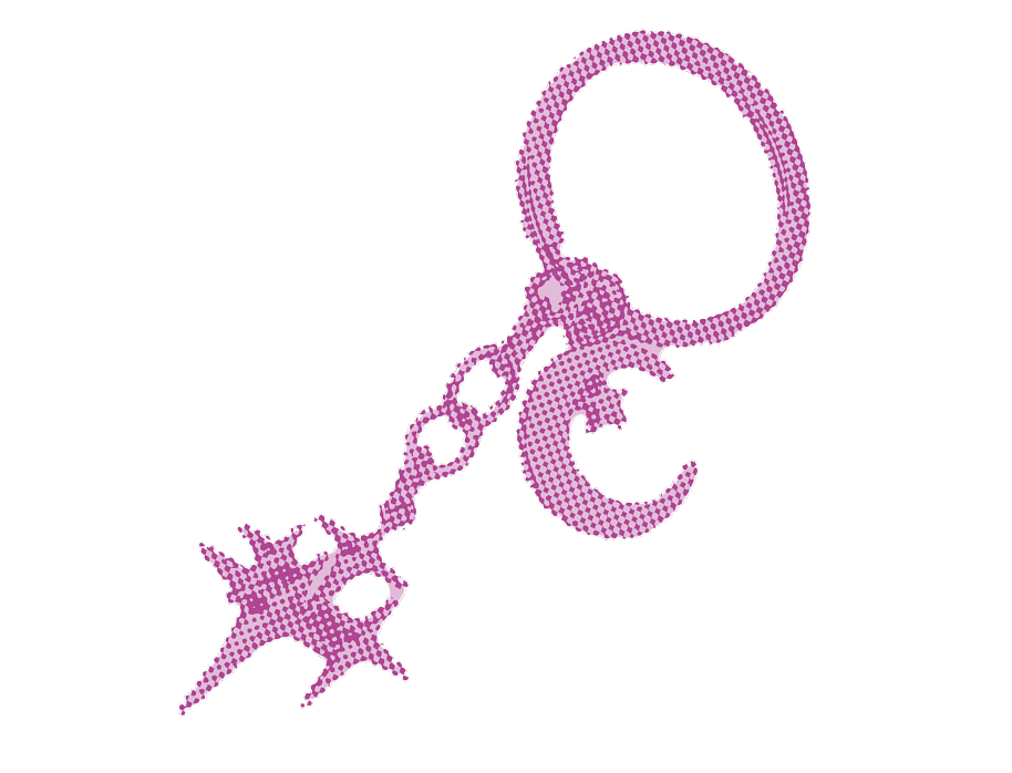
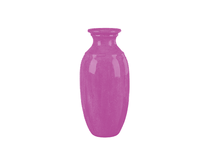
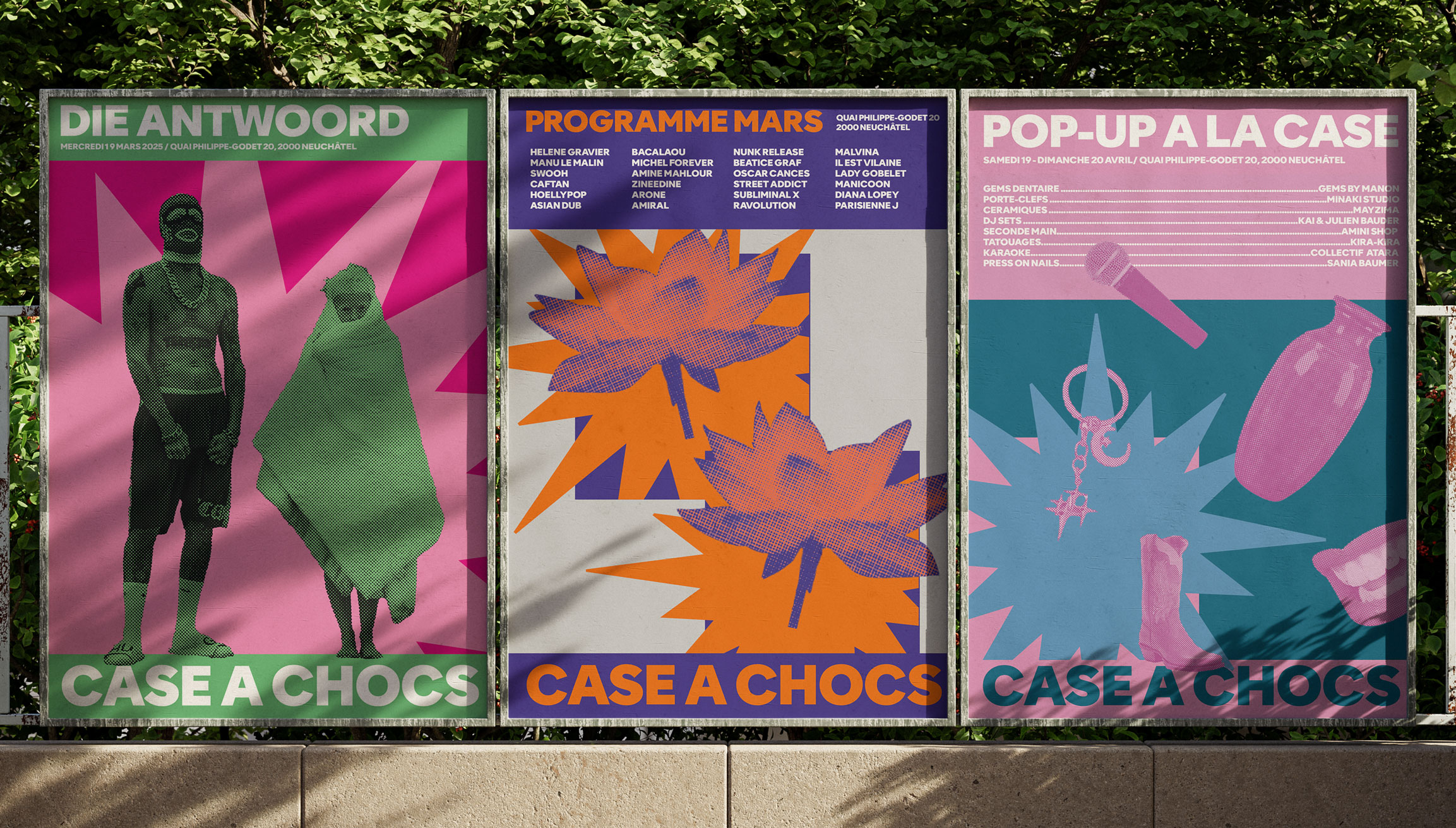
Two bands, at the top and bottom, run through every application. Vibrant colours and halftone-treated images complete the system, so it stays recognisable while adapting to each format.
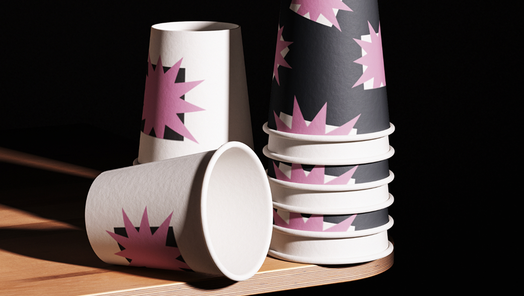
MOVEMENT AND DIVERSITY WERE AT THE HEART OF THE PROJECT
RESEARCH
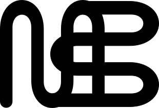
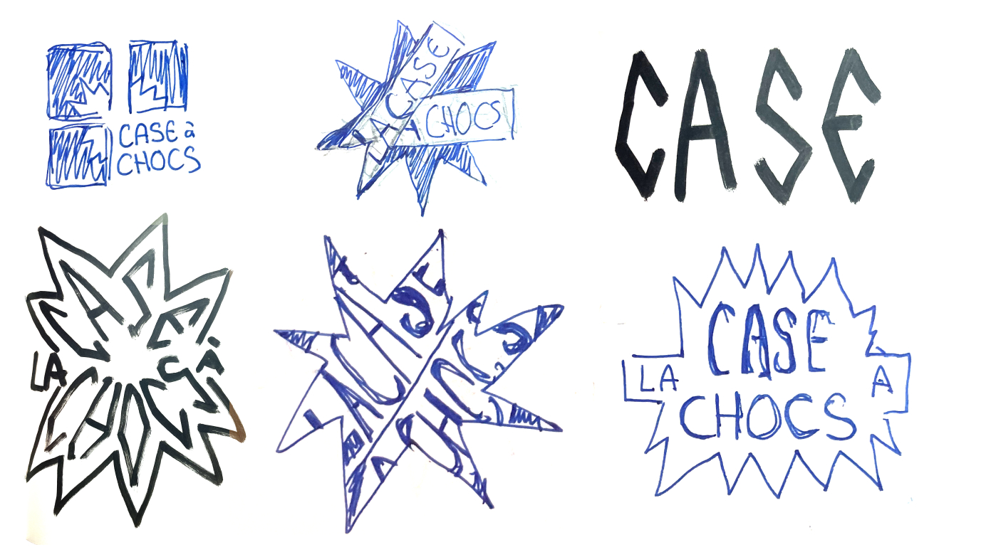
The logo started with a lot of sketching. I first leaned toward a trash, rock identity, but with such a varied programme, I didn’t want to fall into the clichés of a single music genre.
The real challenge was finding how to arrange the elements: a system flexible enough to work across many formats, without taking over the visual. Most of my research went into integrating the star shape so it carries meaning, and making every visual hit hard.