TOBS!
School project
2023
Visual identity
Typography
UI design
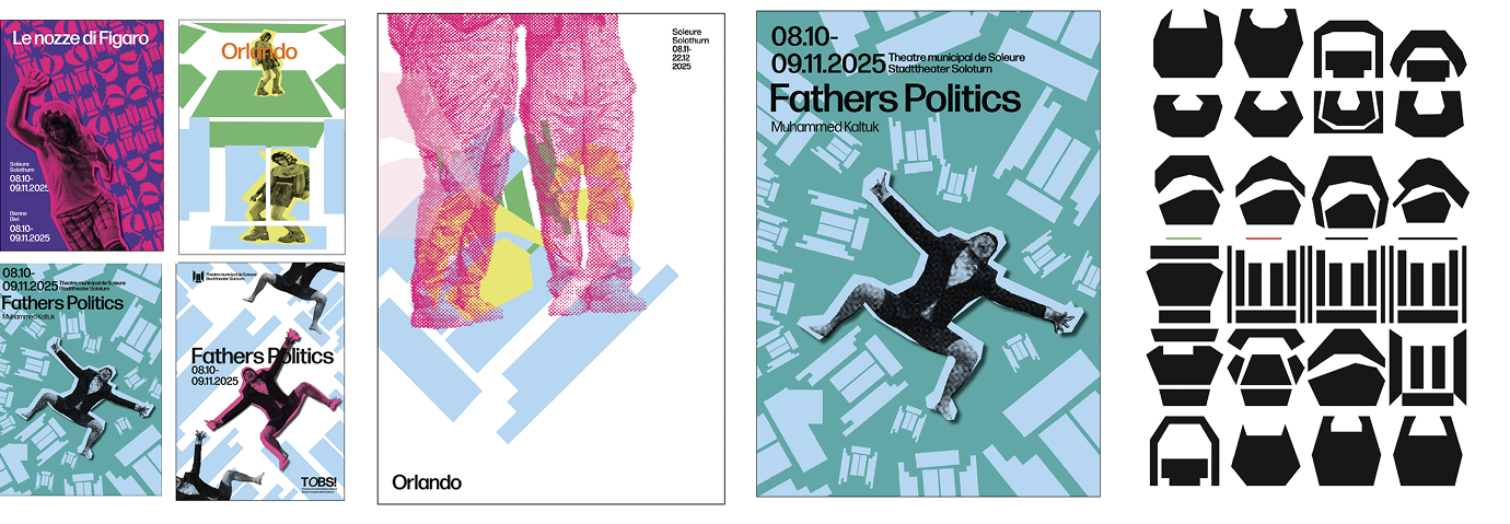
For my first-year exam, I created a complete visual identity for TOBS, a cultural venue shared between two bilingual cities.
SIX VENUES,
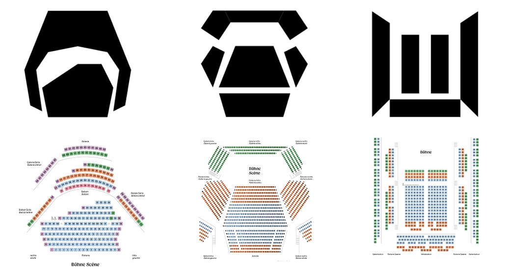
SIX PICTOS
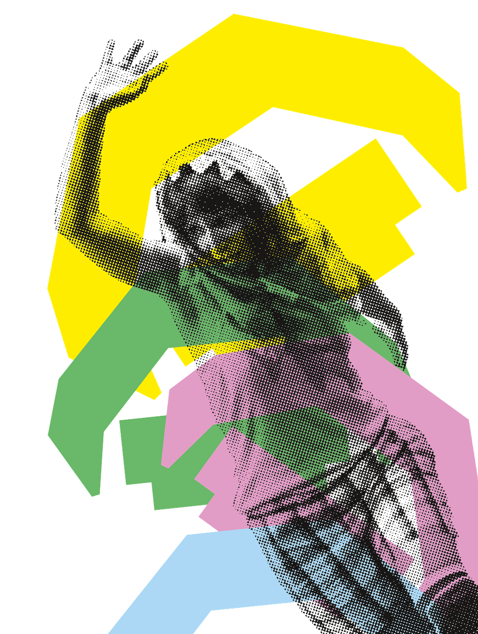
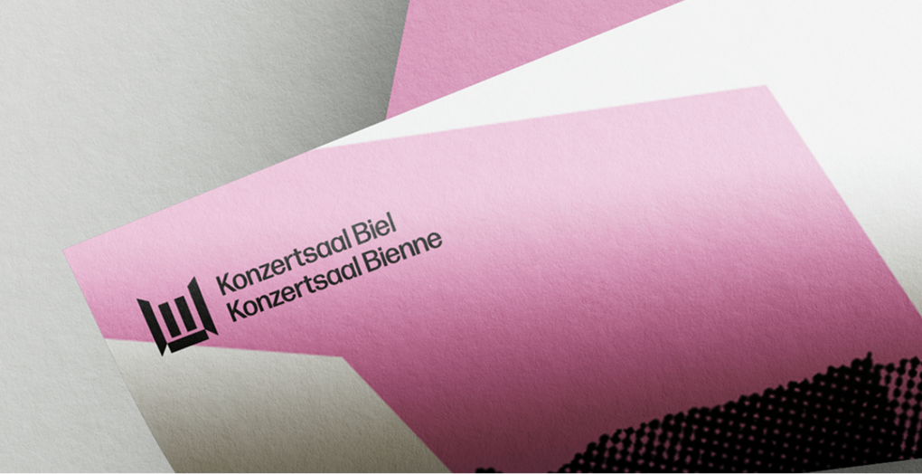
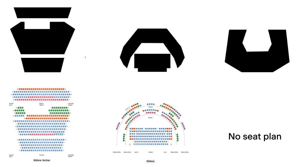
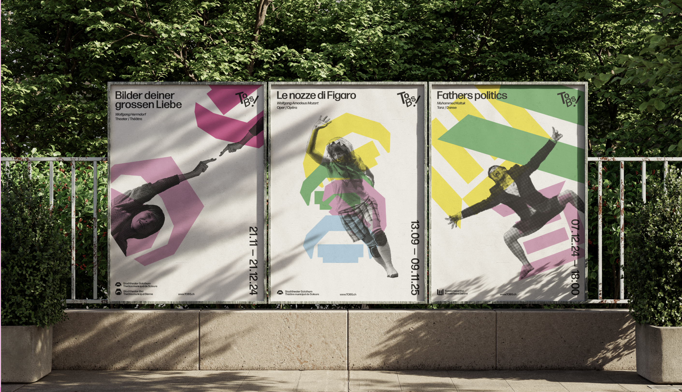
The identity is built on six pictograms, one per venue, forming a recognizable visual language. Free in colour, angle and scale, they overlap on a white background. This contrast between a strict framework and free forms reflects TOBS!: institutional stability serving artistic diversity.
MOVEMENT AND DIVERSITY WERE AT THE HEART OF THE PROJECT
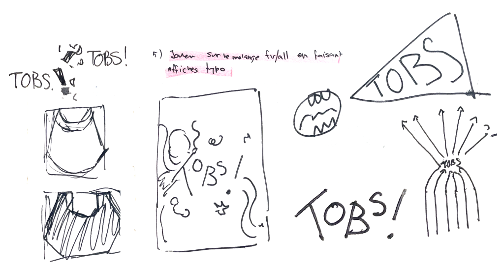
RESEARCH
After conducting extensive visual research based on several different concepts, I wanted to simplify my ideas and get back to the essentials. By asking myself what is truly specific to TOBS!, I came to the conclusion that one of the most emblematic features of this institution is that it has six performance venues spread across two separate cities.